


A look at the SIX most unique kits in ISL history
These kits were more than just fabric – they told stories, sparked pride, and redefined tradition.

A kit is more than just fabric; it’s the identity of a football club. It carries the weight of history, the energy of the fans, and the story of the club itself.
Every new season brings fresh hope, and with it, comes the excitement of a new jersey. Supporters eagerly wait for the official launch. It creates a special kind of buzz among supporters on social platforms: speculations, fan-made concepts, and endless debates. And when the jersey finally drops, it feels like the beginning of something special.
But in many scenarios, clubs in the Indian Super League (ISL) have taken things a step further. While staying true to their core colours, many have used their kits as a storytelling platform. Whether it’s a design rooted in culture, a tribute to a cause, or simply a refreshing visual shift, these jerseys captured attention for a reason.
Here’s a look at some of the most unique kits in ISL history that stood out not just for how they looked, but for what they represented.
Kerala Blasters FC 2020-21 Third Kit
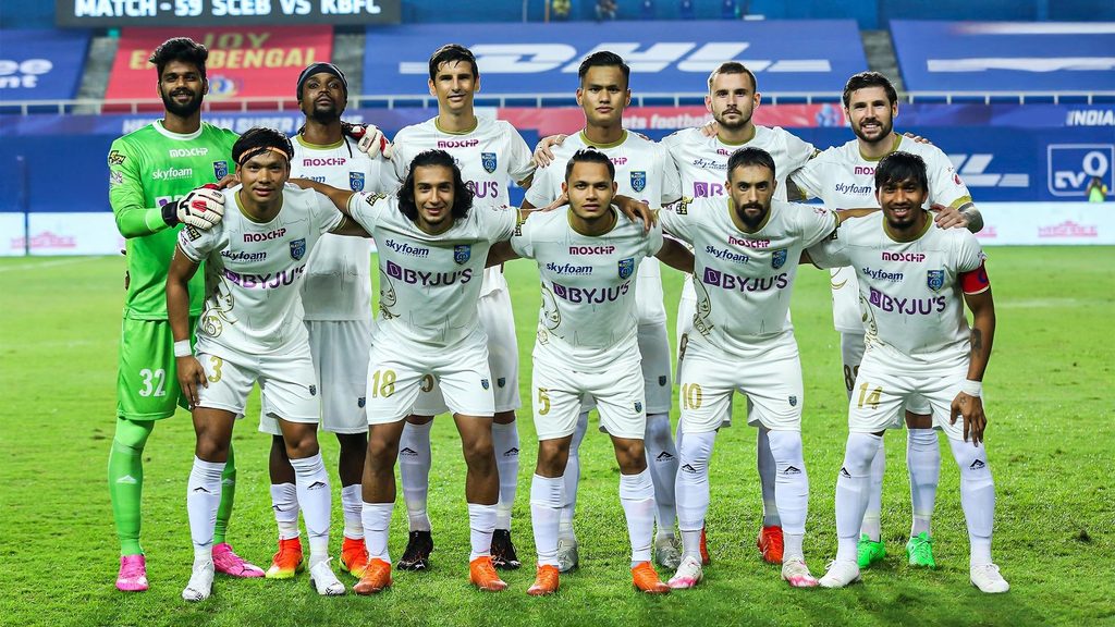
Amid the global battle against COVID-19, the 2020–21 ISL season kicked off inside a strict bio-bubble in Goa. Kerala Blasters FC launched a special third kit that didn’t just win the hearts of Malayalis, it earned praise from across the nation for its powerful tribute.
As part of their #SaluteOurHeroes campaign, the Blasters introduced this jersey dedicated to the brave spirit of frontline workers around the world.
The design cleverly reimagined the iconic KBFC elephant, using elements that symbolised various categories of frontline workers.
And at the heart of it all was a young fan. The jersey was designed by Sumana Sainath, who was a 20-year-old B.Sc. student at Christ University, Bengaluru at the time. Her creation was selected from over 300 entries in a fan design contest run by the club.
Bengaluru FC 2024-25 Third Kit
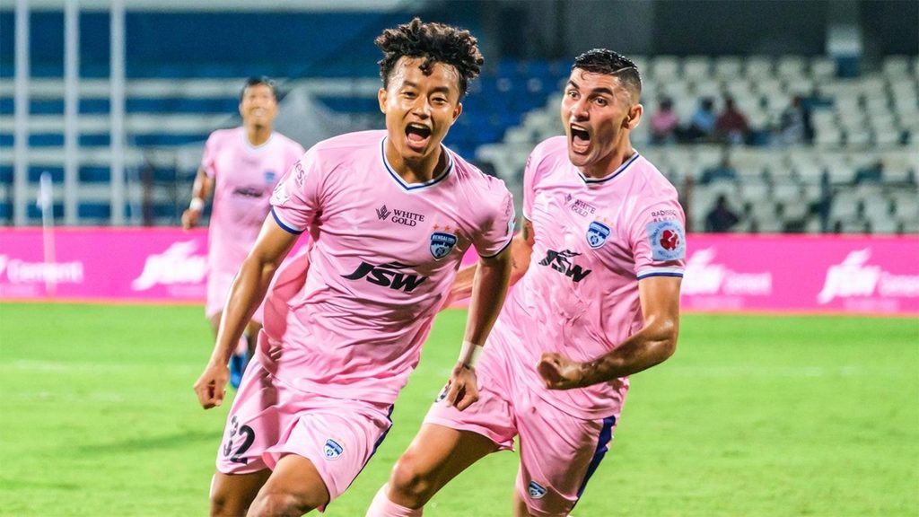
More than just a jersey, Bengaluru FC’s third kit for the 2024–25 season carried a message that echoed far beyond football. Under the banner of the #LouderThanEver campaign, the club dedicated their third kit to the cause of women’s safety and empowerment.
For the first time since their entry into the ISL, Bengaluru FC reintroduced pink into their kit palette. But this was no design experiment. The choice of colour was deliberate, bold, and thought-provoking. It challenged stereotypes and demanded attention.
It was about amplifying voices that need to be heard. Through this jersey, Bengaluru FC reinforced the message that women’s safety must always be a priority.
East Bengal FC 2020-21 Third Kit
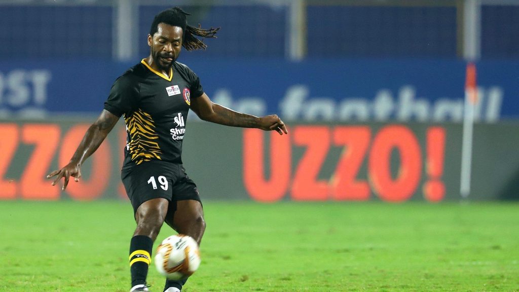
When East Bengal FC made their ISL debut, they didn’t just bring their legacy; they brought three distinct kits that each told a different story.
The home kit stayed loyal to the club’s iconic red and gold, proudly carrying the torch that has long defined East Bengal FC’s identity. The away kit embraced a lighter touch, drawing inspiration from the Ilish (Hilsa) fish, which is deeply tied to the club’s identity and famously enjoyed by fans in celebration after a victory.
But the most striking of the lot was the third kit. In a bold departure from the club’s historic palette, East Bengal FC introduced a black jersey infused with the essence of the Royal Bengal Tiger: a creature that, in West Bengal, embodies pride, energy, and power.
It may have been a surprising shift, but the black jersey struck a chord with fans the moment it dropped.
FC Goa 2024-25 Away Kit

In the 2024–25 season, FC Goa’s away kit offered more than just a new look: it told a story deeply tied to the state of Goa and its natural lifelines. Draped in sky and water blue, the jersey was inspired by the 11 rivers that flow through the region, sustaining its people, nourishing its land, and shaping its culture.
This kit was a quiet but powerful tribute to the water bodies that define Goa’s rhythm, from the rivers that breathe life into its fields to the coastline that feeds its communities.
With flowing textures and a colour palette that reflected serenity and strength, the jersey stood out not just for its design, but for the connection it made with the state.
FC Pune City 2016 Home Kit
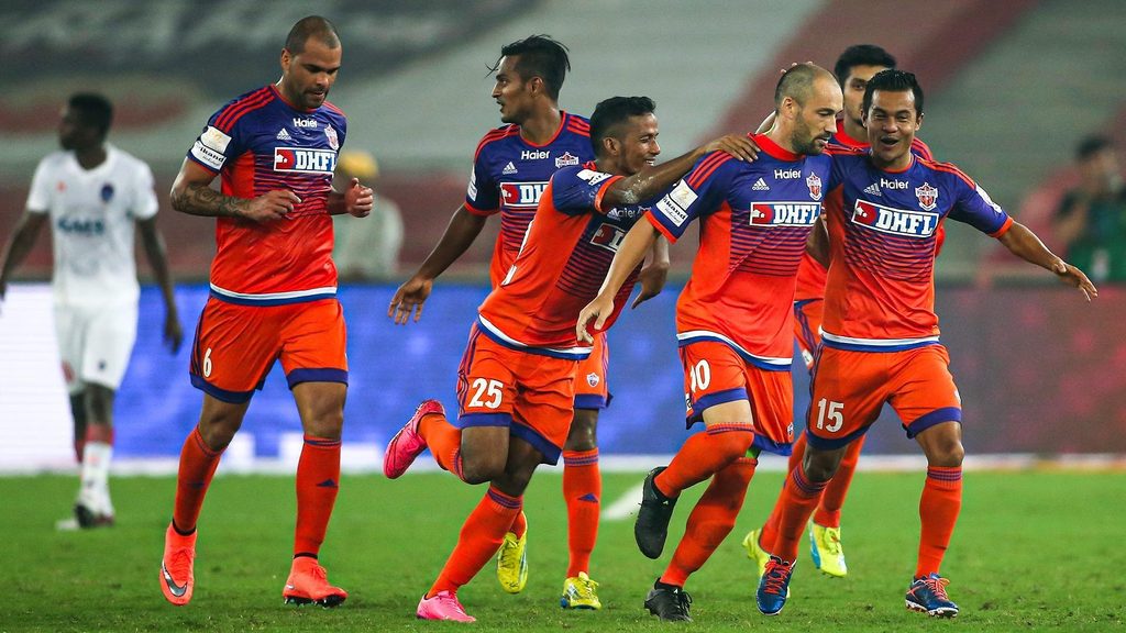
FC Pune City’s kits were always a refreshing burst of vibrancy and individuality due to their unique colour combination, and this particular edition from the 2016 season stood out more than most.
With a striking combination of orange and purple, two colours rarely seen together in football, the design instantly set the club apart.
The jersey featured a vibrant interplay of the two colours, with horizontal stripes across the chest and midriff where purple and orange blended into each other. This created a faded or gradient effect, making it visually unique and one of the most distinctive kits in ISL history.
The orange-and-purple combination, the horses, and the flag in the club crest added a regal touch to the club’s identity.
The colour scheme wasn’t just bold; it also echoed the club’s connection to Italian side ACF Fiorentina, known for their iconic purple kits.
This kit wasn’t just about looks; it resonated with the club’s bold motto: “Play to Win.”
Chennaiyin FC 2024-25 Away Kit

The 2024–25 away kit is one of Chennaiyin FC’s best in recent years. The kit was a tribute to Chennaiyin FC’s home, the Marina Arena, capturing the unity, energy, and spirit that define their fortress.
It masterfully balanced simplicity with sharp contrasts. Dominated by a clean white base, the jersey is elevated by bold splashes of deep blue and vibrant yellow across the shoulders and sides, echoing the club’s primary colours but reimagined in a fresh, modern way.
It’s a kit that feels rooted in club tradition but isn’t afraid to break the mould. It’s simple, eye-catching, and full of style.


